A familiar brand.
A digital expression.
How I approached a website for Vylana Davis and Lana’s Interior Design, connecting the business’s established identity with a clear way to explore its work.
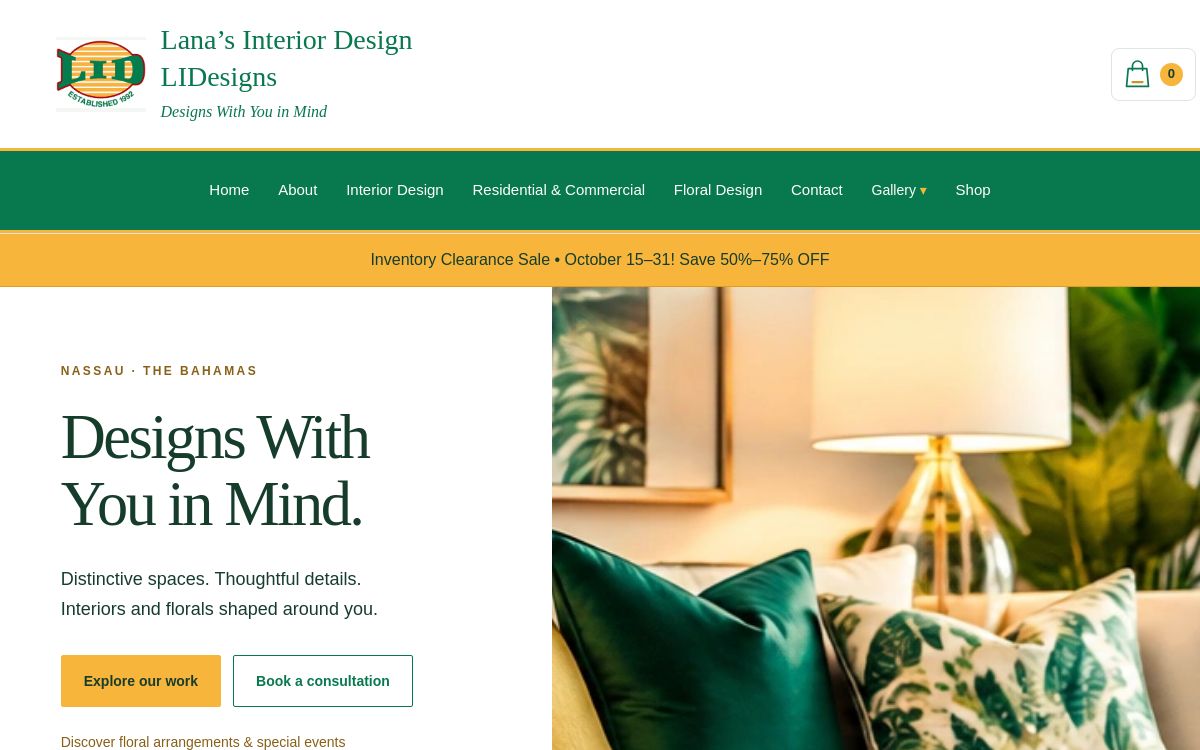
Website preview. The live website may evolve as content and features are updated.
Designs With
You in Mind.
Representing an established identity
Lana’s Interior Design serves residential and commercial clients in The Bahamas. The website needed to introduce the business, showcase its work and make the next step clear for potential clients.
What I wanted visitors to understand
Who the business is, what it offers and how to get in touch. The aim was to organise that information into a website that feels connected to the brand, rather than a collection of unrelated pages.
Starting with
the identity.
One decision I’m particularly proud of is the colour palette inclusive of white, green and yellow. Drawing on the logo creates a consistent connection between the website and the business people recognise.
Representative palette swatches illustrating the design direction.
The colours work together with typography, imagery and spacing. My intention is for the brand to feel present throughout the experience, while keeping the content easy to read.
Giving every
element a job.
Images that support the message
I consider how an image relates to the text beside it. A visitor should be able to connect what they see with the service being described.
Space to understand the content
Clear sections and room between elements help separate ideas. I ask whether another image adds useful context or simply makes the page feel crowded.
A clear route through the business
The content is organised around learning about the business, exploring its services and work, and finding contact information. Each area supports a different question a visitor might have.
From interest
to enquiry.
Business introduction
The business story and brand messaging provide context before a visitor explores individual services.
Services and visual work
Residential and commercial design content, floral design and gallery areas give the business space to explain and show its offerings.
Shop and contact information
Product browsing and contact areas serve different intentions: exploring available items or starting a conversation about a project.
Listen. Organise.
Build. Refine.
My approach starts with understanding the business, then shaping its content into a clear experience.
Understand the business
Listen to the owner’s ideas, identify the audience and establish what the website should communicate.
Plan the content and layout
Group related information and consider where text, images and actions belong. Simple boxes and lines can help me explore a layout before building.
Connect the design to the brand
Use the identity as a starting point for colours and presentation, then develop the pages around the supplied content.
Review and refine
Gather feedback, check links and layouts, and refine the experience as the project develops.
A website
to build on.
The delivered website brings the brand’s identity, services and visual content together at one address. Visitors can explore the business online and find a way to make contact.
What comes next
Search visibility, enquiries and sales impact should be assessed using actual data over time. No performance figures are claimed here. Future updates can show what changes and what is learned.
Your business.
Your direction.
Tell me what you do, who you want to reach and what you want your visitors to experience.